Cherry Kiss


I am obsessed with make up, especially when it’s colorful and fun. I wanted to make a brand that combined some elements I love in packaging and combine the 70’s aesthetic with a modern feel to it.

Moodboard
Logo
During my research, I took notice of what Gen Z, my target audience, was drawn towards. They are drawn towards makeup with unique fonts, eye-catching colors, and illustrative elements. Patterns and illustrations are very popular in both fashion and packaging.
I tried to blend it with what I liked in makeup, but I was more drawn towards a summer color palette versus the the common autumn palette that is common in 70’s style. I also like different textures and details to my products, such as gold foil and holographic elements.
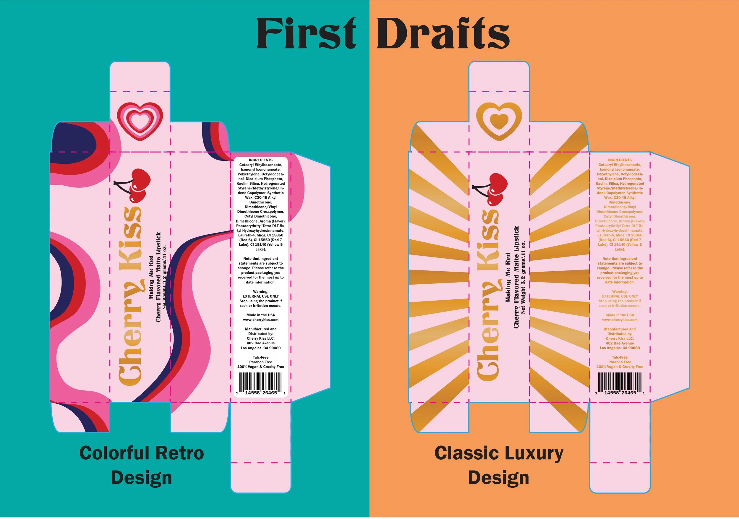
First step to be made was creating the box. Before you can focus on the fun design, you need to make a manufacturer friendly box. I experimented with two design with different shapes and colors. They both did not look as it would in the sketch, especially for the front of the box and the ingredients.
When it was being reviewed by my peers, they preferred the pattern to the gold look, but wanted the colors of the retro design.
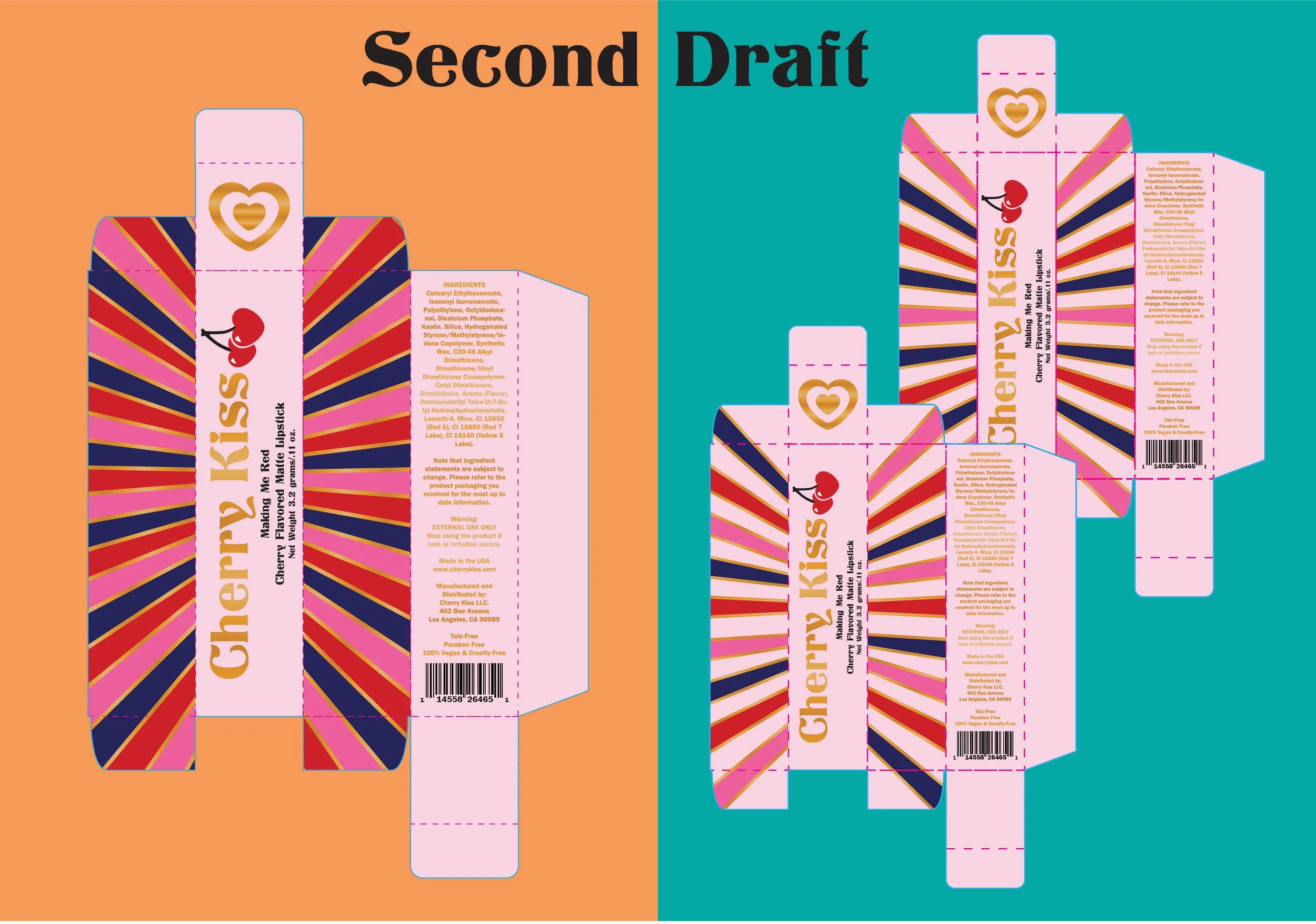
The second draft took the previous feedback and played around with the different color combinations. I added the gold to the lines of the design, which ties it to the previous draft. I loved the full design on the sides, but it was very busy and clashed considering half of the box is more subdued. With the other design, I experimented with how the colors would play.
The color combination was the trickiest form of feedback because people had various opinions and it was splitting. I had to keep removing the lesser denominator, but the final design and the design on the right were evenly split. I decided to make an executive decision though to pick the design that focused more on the red and pink.
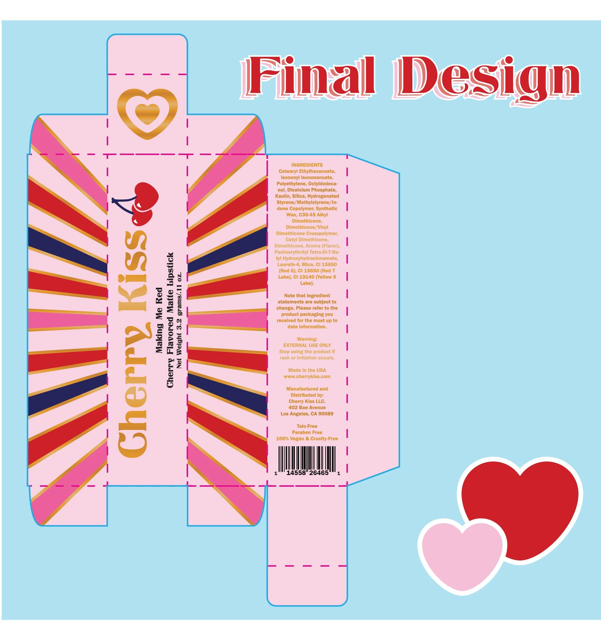
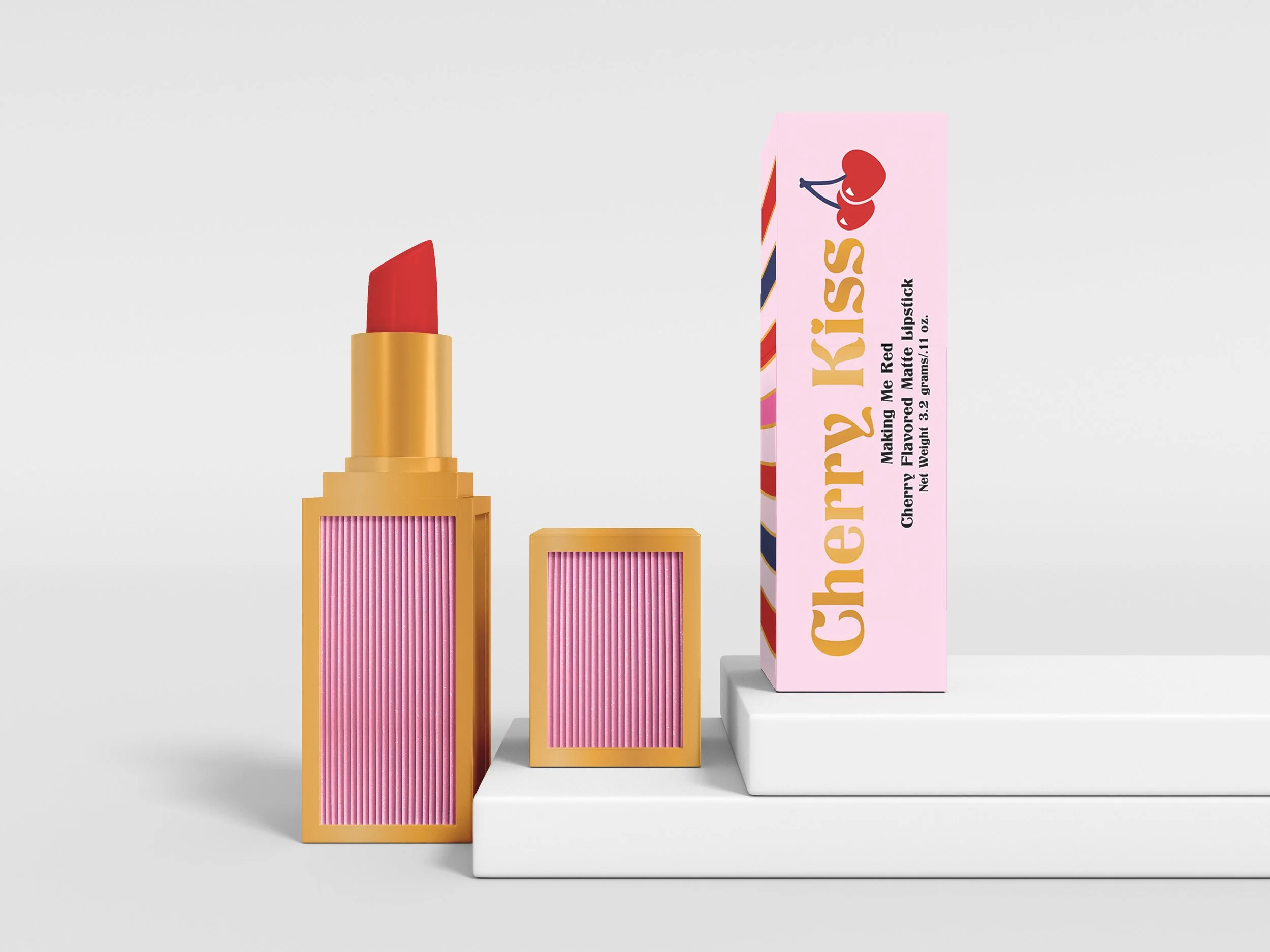
This is the final design of the lipstick product. I made the pink and red more focused and changed the cherry stem to match the blue. I am very pleased with this design and plan to continue more of the project and make more designs.

After the design was finalized, I wanted to make a few colors for samples on how the brand would approach multiple products. They all were flavored lipstick so I stuck with colors that could have flavors to them, such as chocolate and bubblegum.
I did run into a problem once I started making multiple colored lipstick and that was that there was no way to display what the color would look like to a person picking it up for the first time. I decided to change the gold heart on top so it could indicate what the color would look like.